Discover, visualize and detect fraud!
Discovering the data
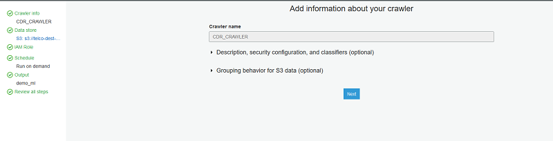
In the AWS Glue console, set up a
crawler and name it CDR_CRAWLER.
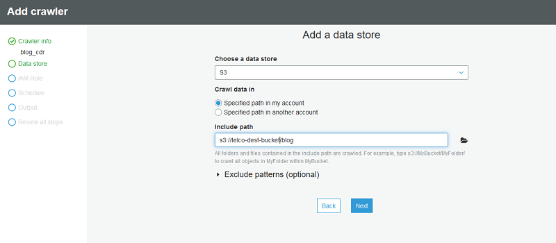
Point the crawler to s3://telco-dest-bucket/blog where the Parquet CDR data
resides.
Next, create a new IAM role to be used by the AWS Glue crawler.
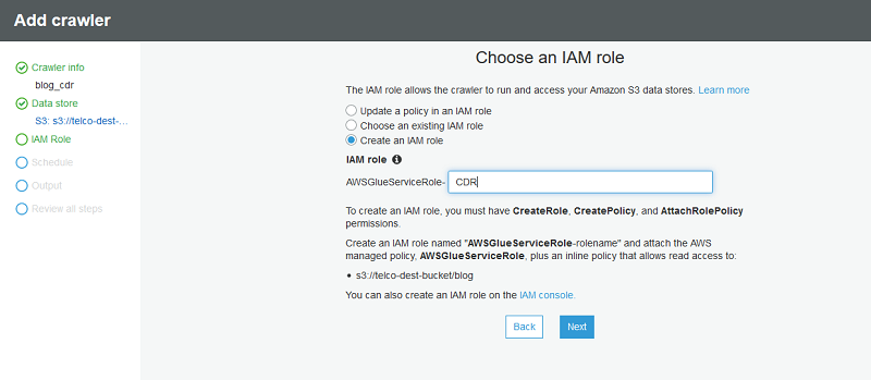
For Frequency, leave the default value Run on Demand.
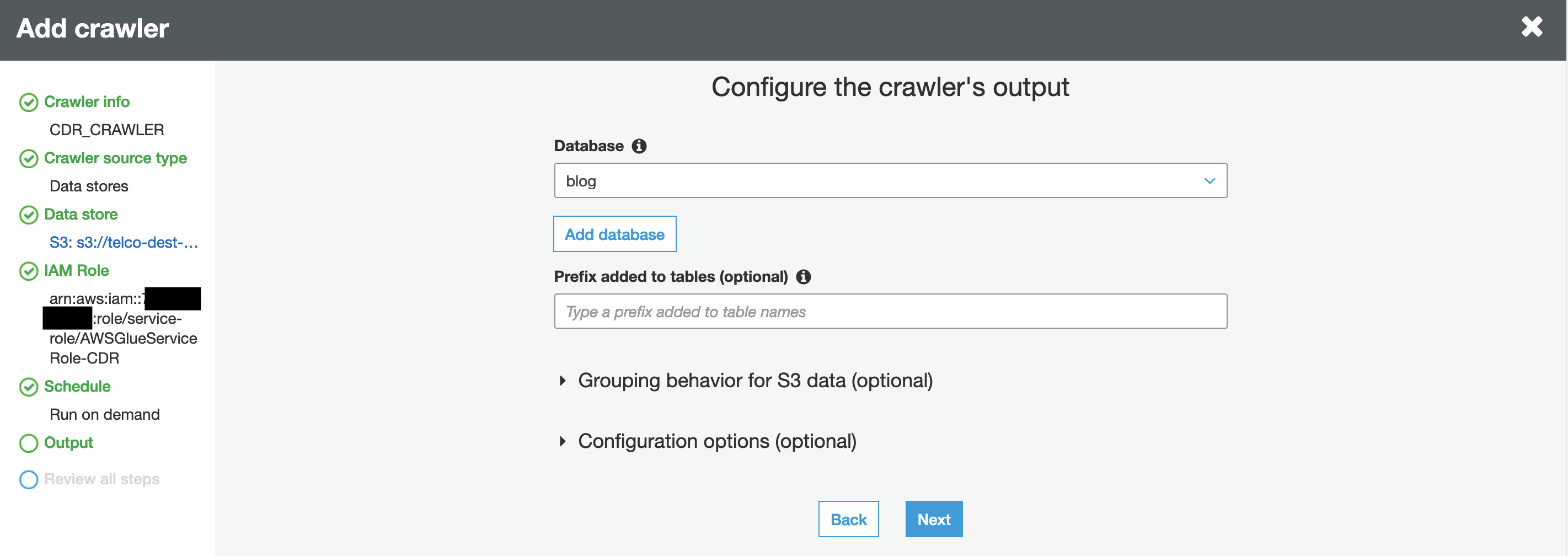
Next, choose Add database and define the name of the database. This database contains the table discovered by the AWS Glue crawler.
Choose next and review the crawler settings.
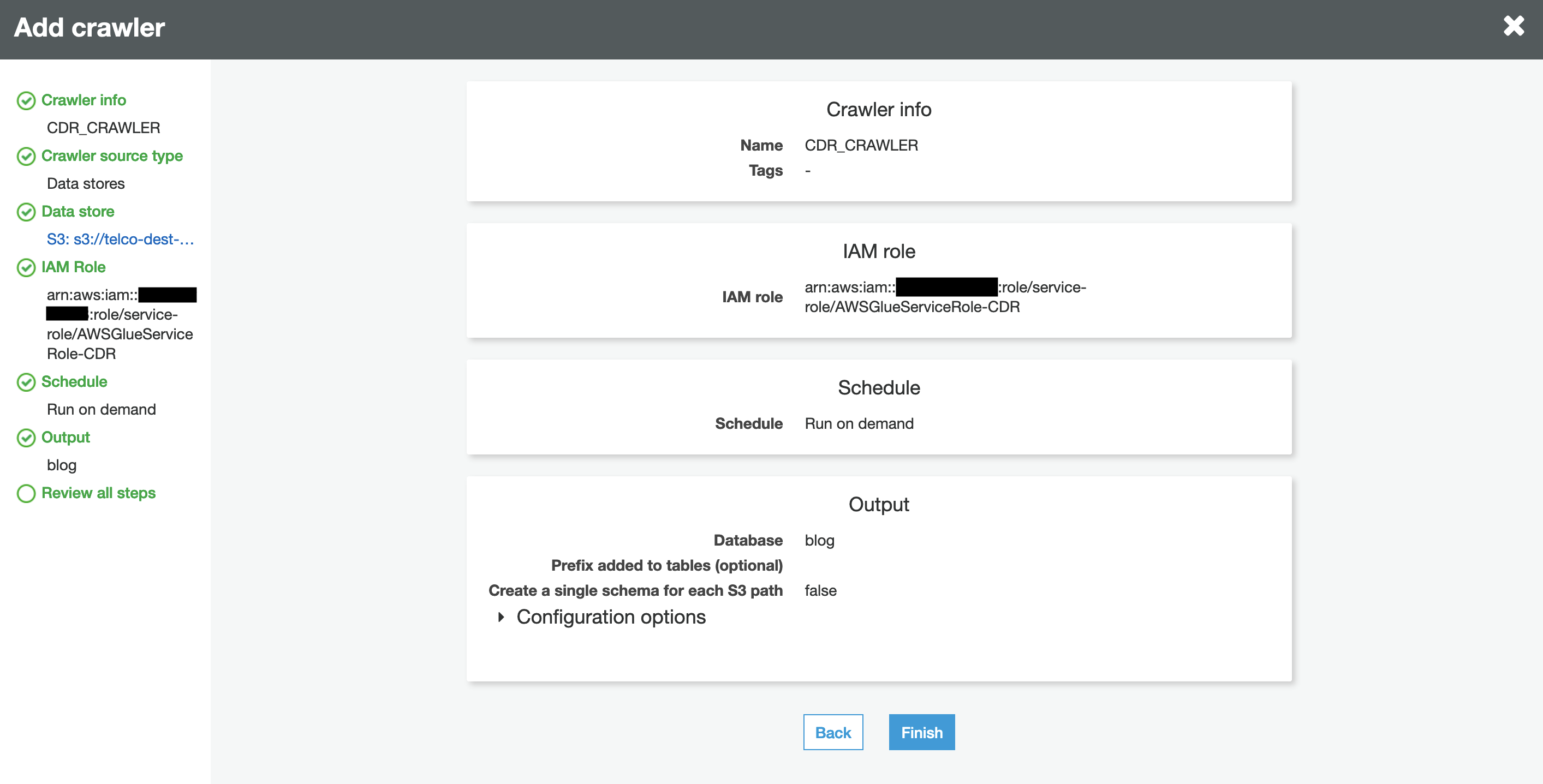
When you’re satisfied, choose Finish.
Next, choose Crawlers, select the crawler that you just created (CDR_CRAWLER),
and choose Run crawler.
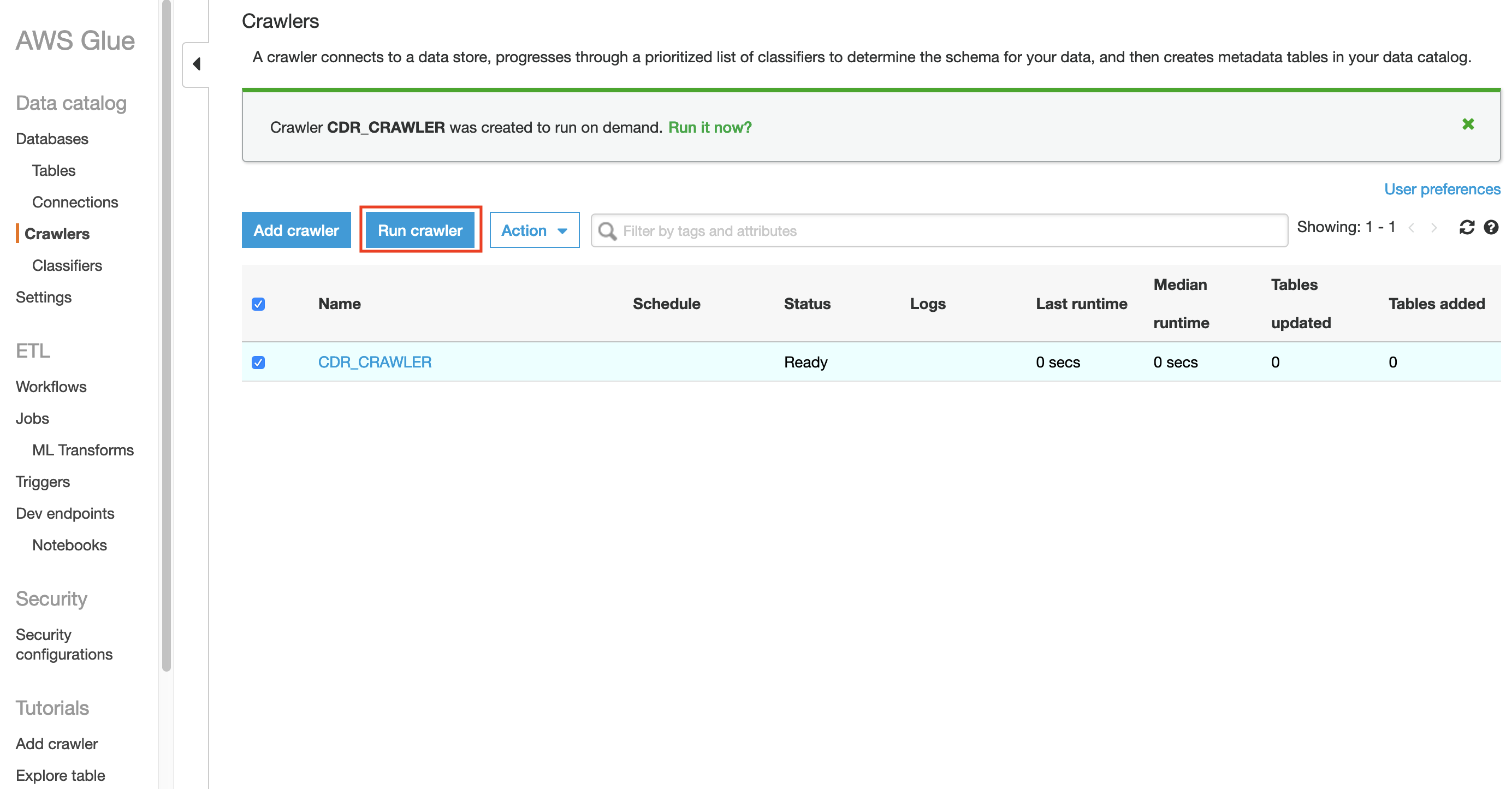
The AWS Glue crawler starts crawling the database. This can take one minute or more to complete.
When it’s complete, under Data catalog, choose Databases. You should be able to
see the new database created by the AWS Glue crawler.
In this case, the name of the database is blog.
To view the tables created under this database, select the relevant database and choose Tables. The crawler’s table also points to the location of the Parquet format CDRs.
To see the table’s schema, select the table created by the crawler.
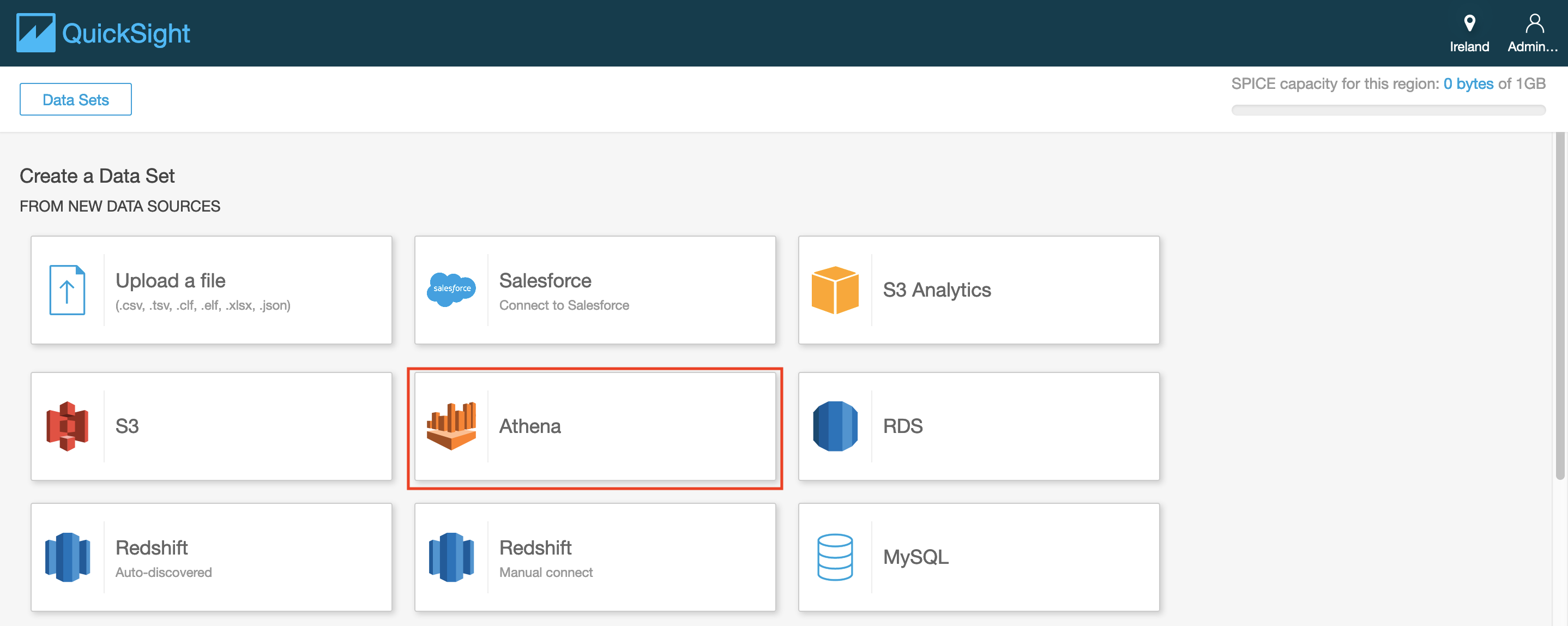
Amazon QuickSight and anomaly detection
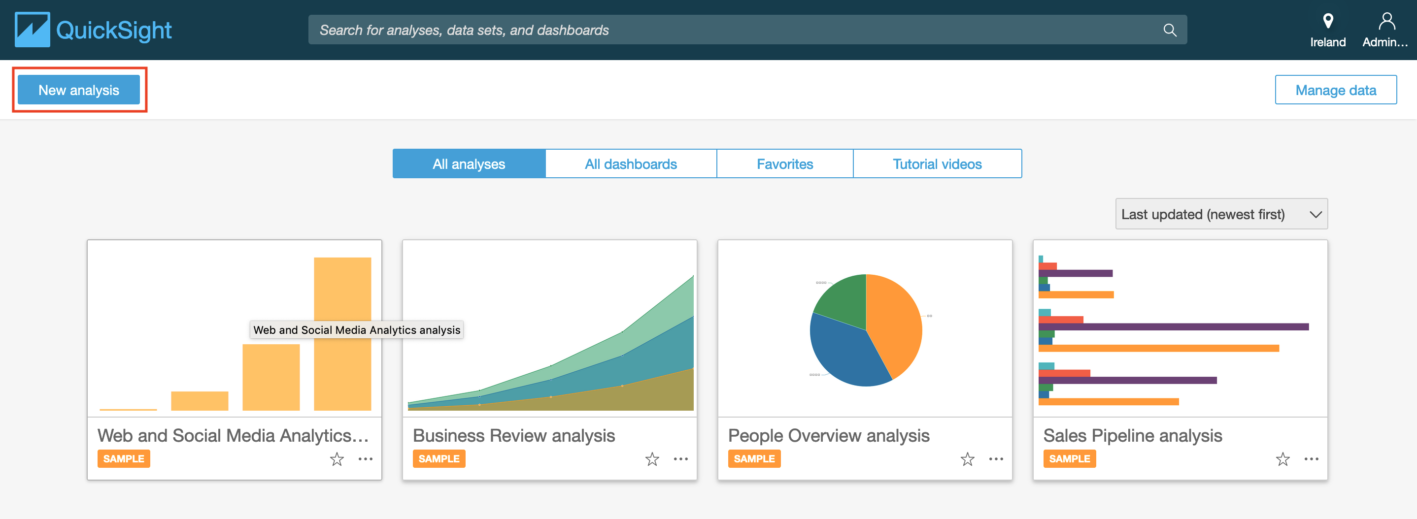
Next, build out anomaly detection using Amazon QuickSight. To get started, follow these steps.
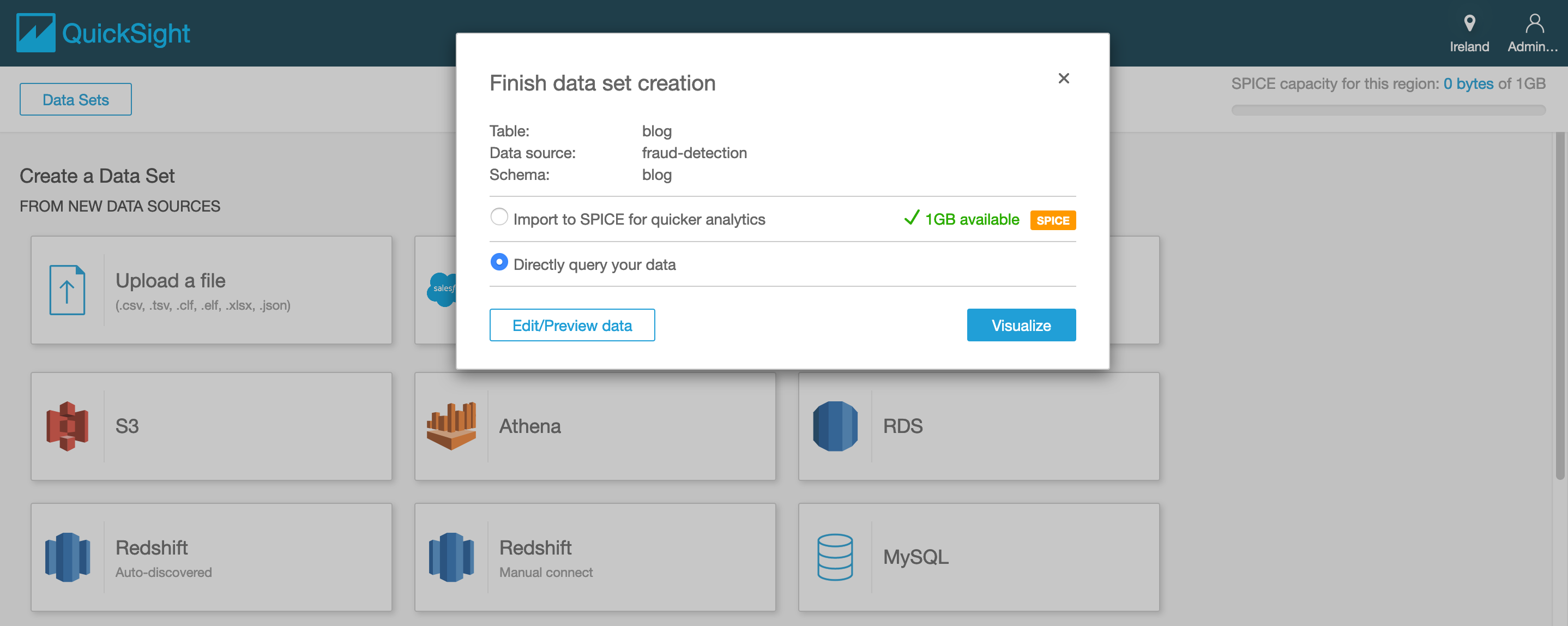
- In the Amazon QuickSight console, choose new analysis.
- click on create new data set
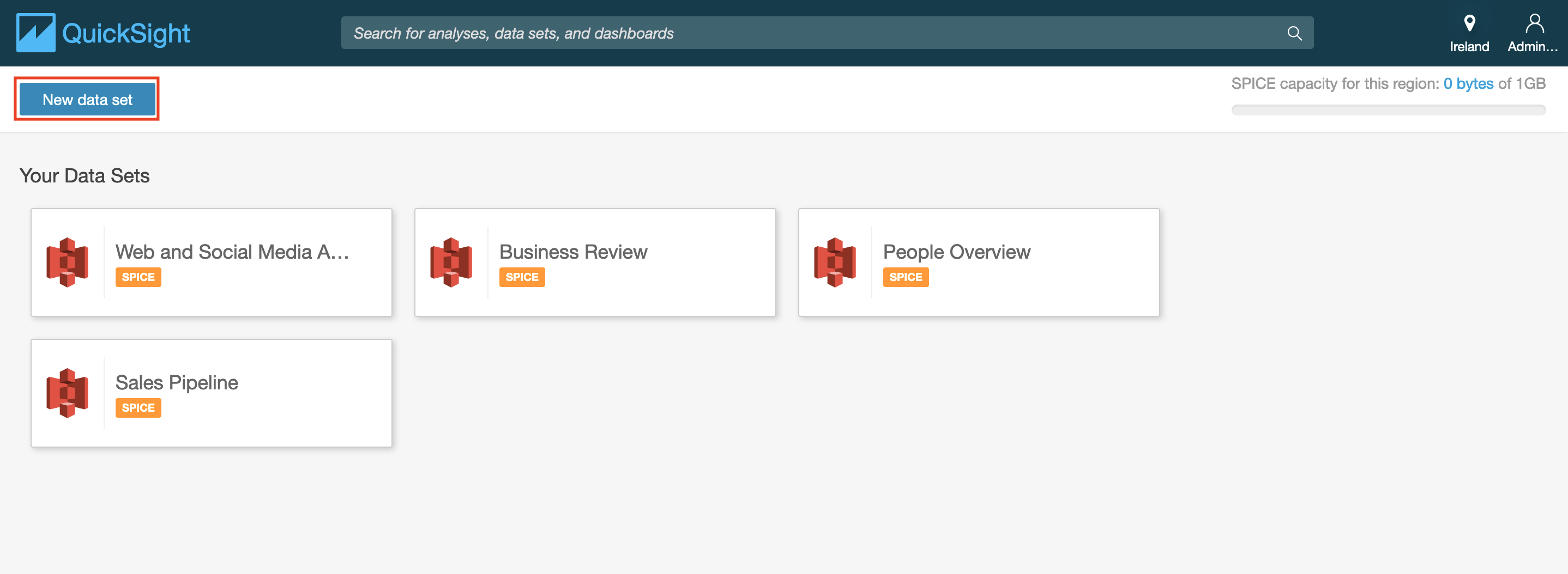
- select Athena
- enter a data source name
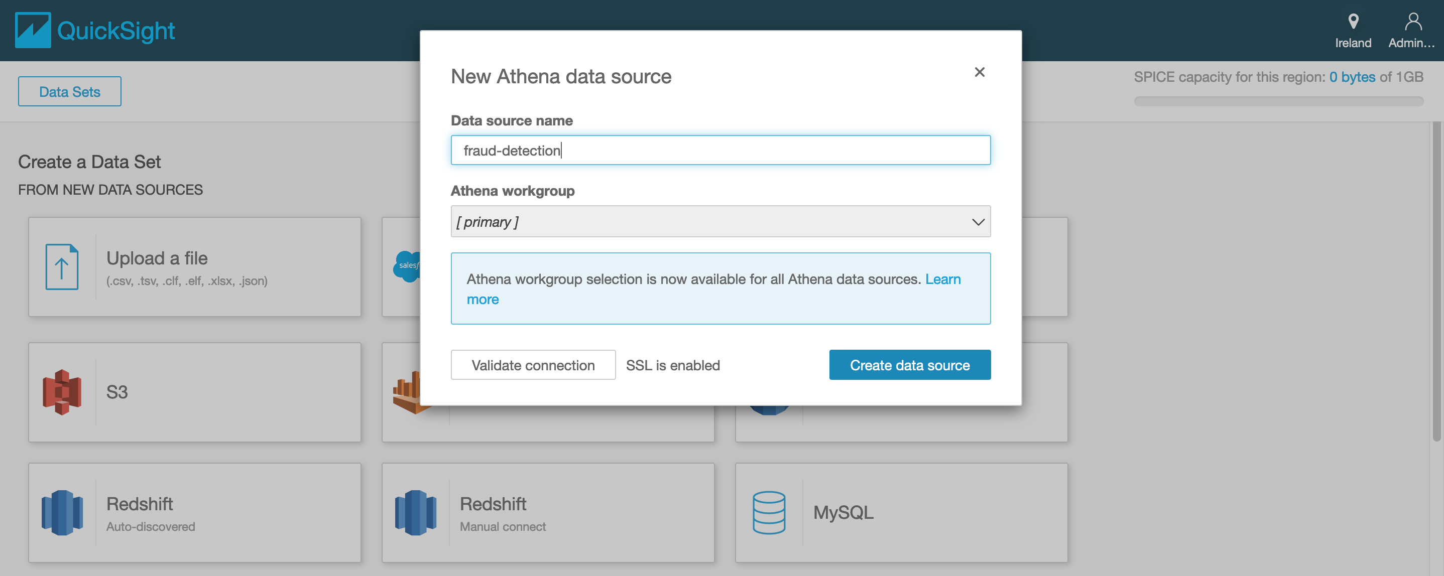
- click on create data source
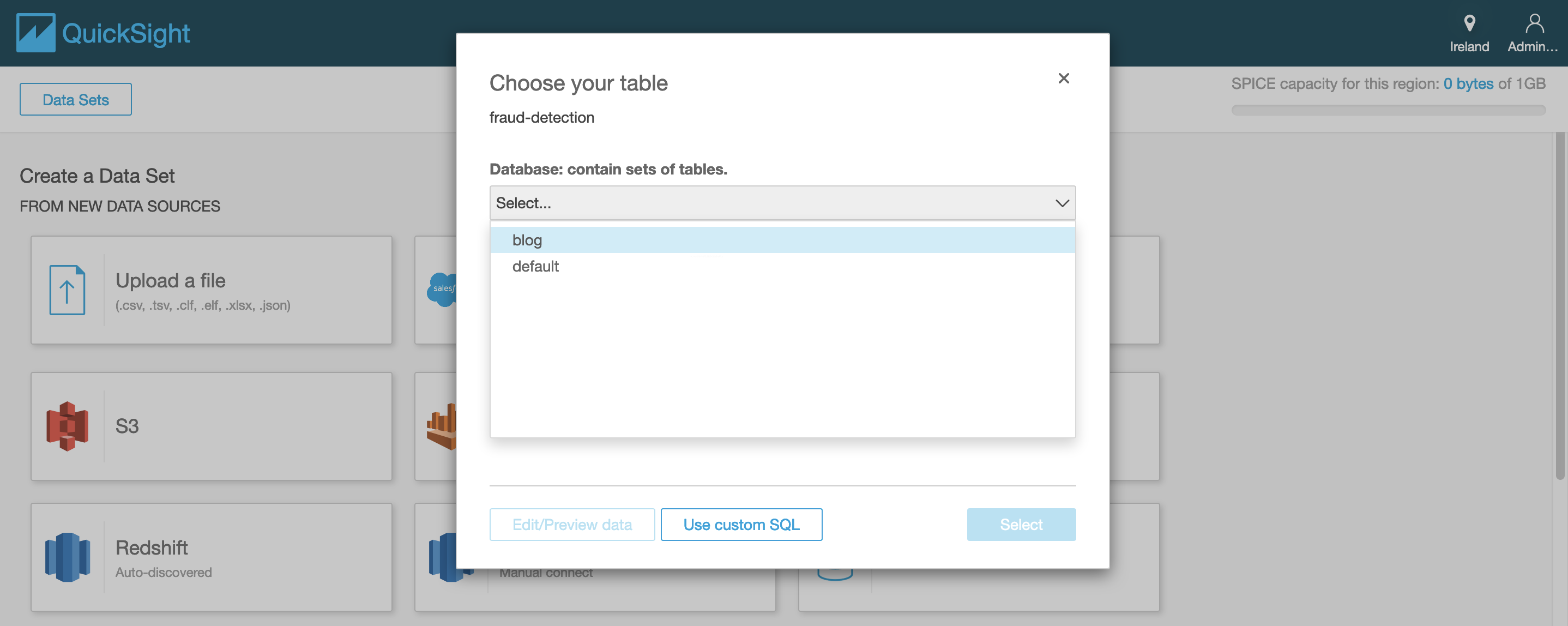
- select from the drop down list the relevant database and table that were
created by the AWS Glue crawlers and click on select
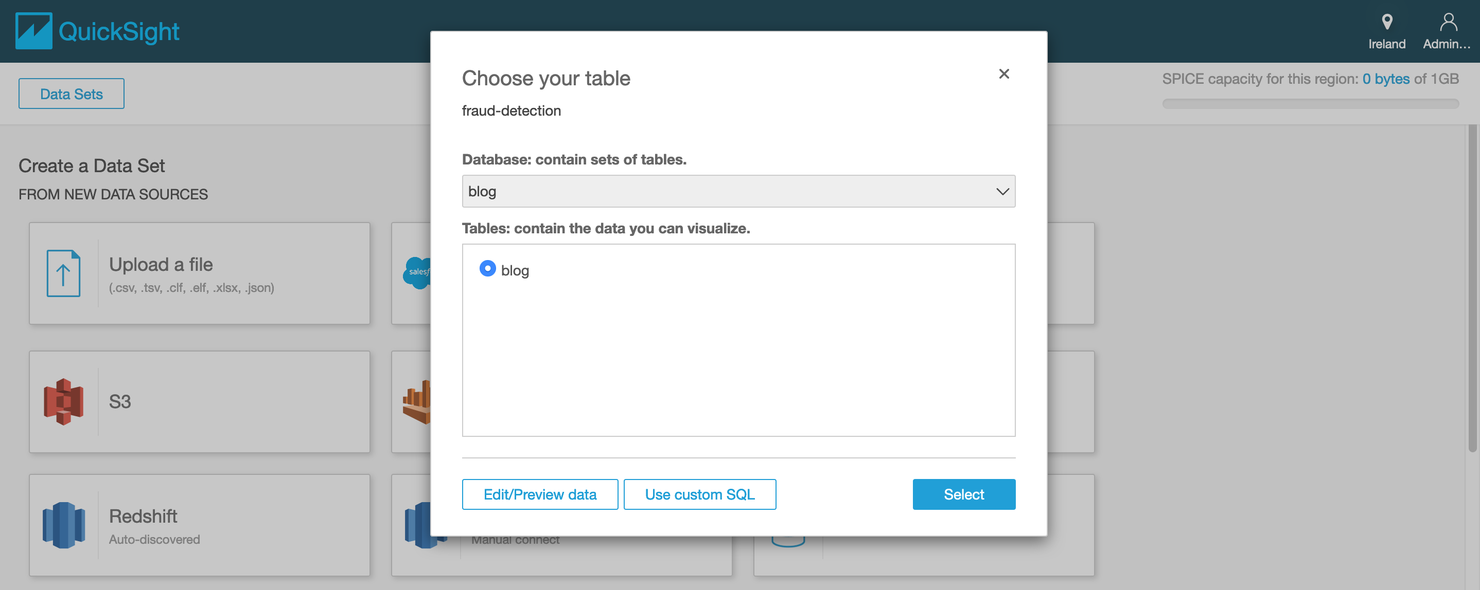
- select directly query your data and click visualize
Visualizing the data using Amazon QuickSight
Under visual types, choose Line chart.
Drag call_service_duration to the Value field well.
Drag Date to the X axis field well.
Amazon QuickSight generates a dashboard, as in the following screenshot.
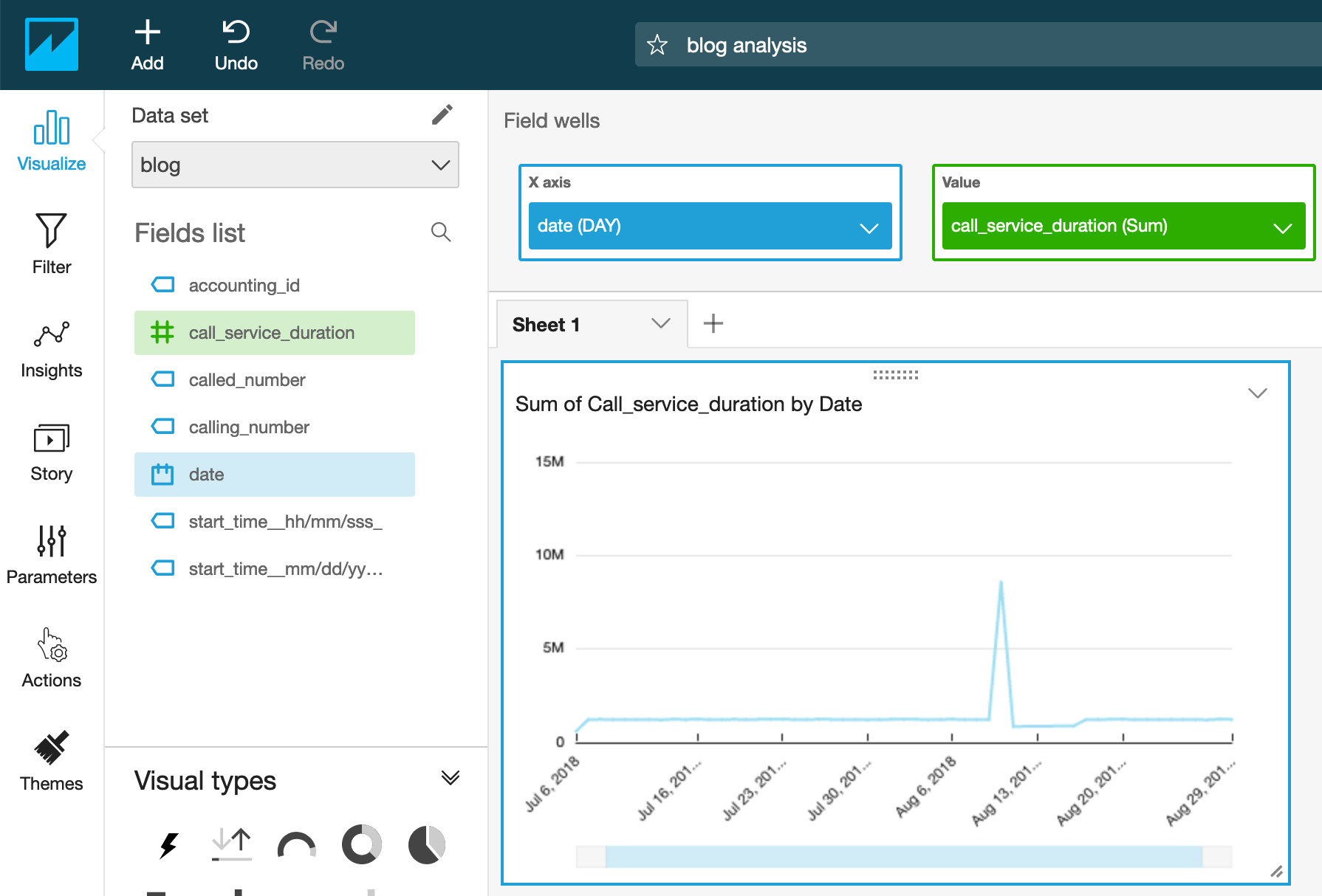
On the x-axis it is represented the full Date at which the call happened. By default, its aggregation window is 1 day. This can be changed by choosing a different value.
Because we currently define the Date to look on one-day aggregations, the call duration is a sum of all call durations from all call records within a day. We can begin the search by looking for days where the total call duration is high.
Anomaly detection
Now look at how to start using the ML insights anomaly detection feature.
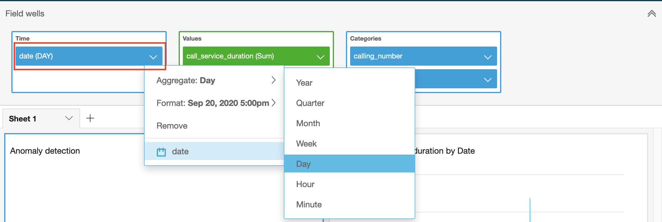
- On the top of the Insights panel, choose Add anomaly to sheet. This creates an insights visual for anomaly detection.
- On the top of the screen, choose Field Wells and add at least one field to
the Categories, as in the following example. We added the calling/called
number, as those become relevant for fraud use cases; for example, one
A-numbercalling multipleB-numbersor multipleA-numberscallingB-numbers.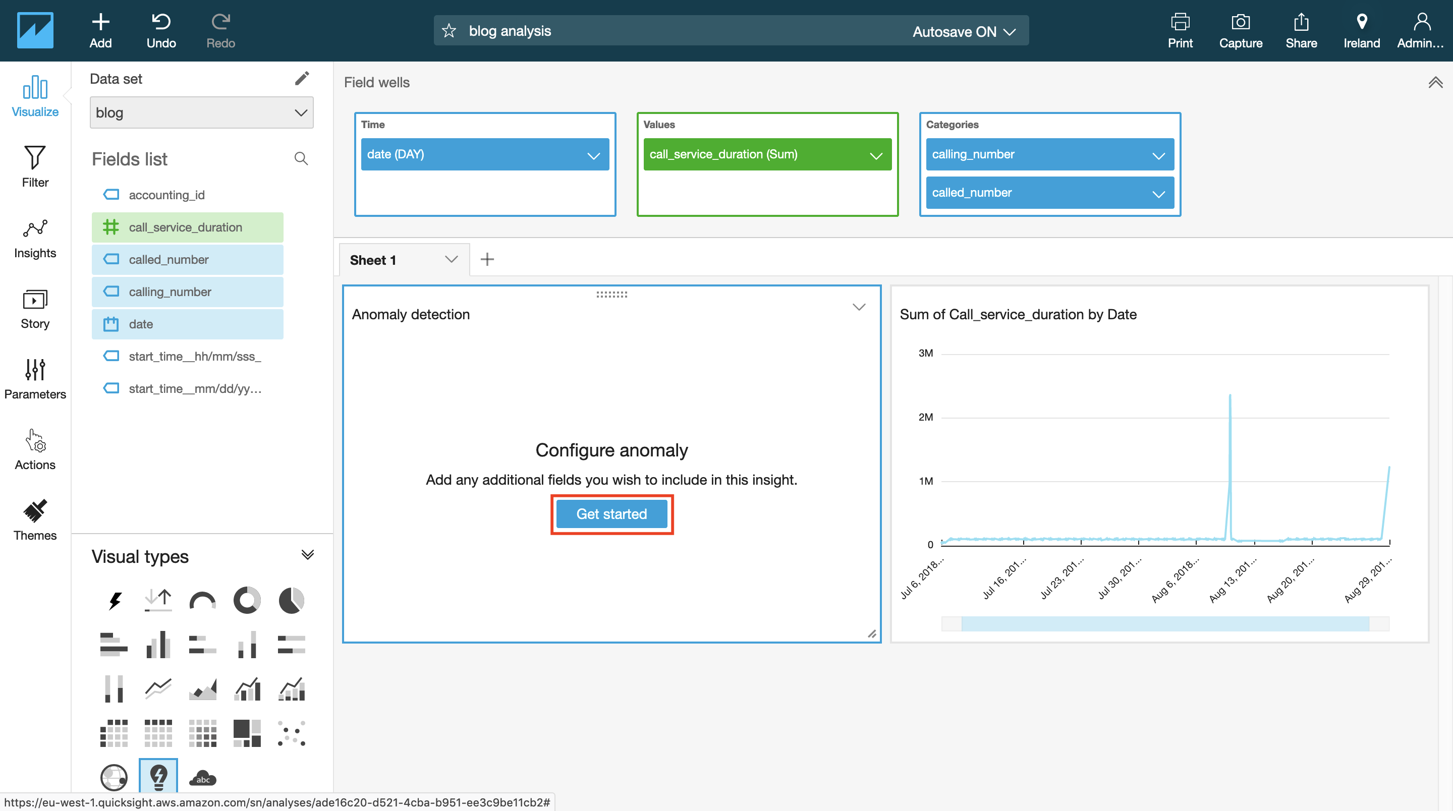
The categories represent the dimensional values by which Amazon QuickSight splits the metric. For example, you can analyze anomalies on sales across all product categories and product SKUs — assuming there are 10 product categories, each with 10 product SKUs. Amazon QuickSight splits the metric by the 100 unique combinations and runs anomaly detection on each of the split metric.
- To configure the anomaly detection job, choose Get Started.
On the anomaly detection configuration screen, set up the following options:
- Analyze all combinations of these categories—By default, if you have selected three categories, Amazon QuickSight runs anomaly detection on the following combinations hierarchically: A, AB, ABC. If you select this option, QuickSight analyzes all combinations: A, AB, ABC, BC, AC. If your data is not hierarchical, check this option.
- Schedule — Set this option to run anomaly detection on your data hourly, daily, weekly, or monthly, depending on your data and needs. For Start schedule on and Timezone, enter values and choose OK. Important: The schedule does not take effect until you publish the analysis as a dashboard. Within the analysis, you have the option to run the anomaly detection manually without the schedule. Contribution analysis on anomaly – You can select up to four additional dimensions for Amazon QuickSight to analyze the top contributors when an anomaly is detected. For example, Amazon QuickSight can show you the top customers that contributed to a spike in sale. In my current example, We added one additional dimension: the accounting ID. If you think about a telecom fraud case, you can also consider fields like charging time or cell ID as additional dimensions.
After setting the configuration, choose Run Now to execute the job manually, which includes the “Detecting anomalies… This may take a while…” message. Depending on the size of your dataset, this may take a few minutes or up to an hour.
When the anomaly detection job is complete, any anomalies are called out in the insights visual. By default, only the top anomalies for the latest time period in the data are shown in the insights visuals.

Anomaly detection reveals several B numbers being called from multiple A numbers
with a high call service duration on August 29, 2018. That looks interesting!
1. To explore all anomalies for this insight, select the menu on the top-right
corner of the visual and choose Explore Anomalies.
1. On the Anomalies detailed page, you can see all the anomalies for the latest
period.

In the view, you can see that two anomalies were detected, showing two time series.The title of the visuals represents the metric that is run on the unique combination of the categorical fields. In this case:
[All] | 96450000243512000024 | [ALL]
So the system detected anomalies for multiple A-numbers calling 9645000024,
and 351200024 calling multiple B numbers. In both cases, it observed a high
call duration. The labeled data point on the chart represents the most recent
anomaly that is detected for that time series.
- To expose a date picker, choose show anomalies by date at the top-right
corner. This chart shows the number of anomalies that were detected for each
day (or hour, depending on your anomaly detection configuration).
You can select a particular day to see the anomalies detected for that day.
For example, selecting August 10, 2018 on the top chart shows the anomalies
for that day:

Important
The first 32 points in the dataset are used for training and are not scored by the anomaly detection algorithm. You may not see any anomalies on the first 32 data points.You can expand the filter controls on the top of the screen. With the filter controls, you can change the anomaly threshold to show high, medium, or low significance anomalies.
You can choose to show only anomalies that are higher than expected or lower than expected. You can also filter by the categorical values that are present in your dataset to look at anomalies only for those categories.
Look at the contributors columns. When you configured the anomaly detection, you defined the accounting ID as another dimension. If this were real call traffic instead of practice data, you would be able to single out specific accounting IDs that contribute to the anomaly.

When you’re done, choose Back to analysis.